The Psychology of Color in Branding and Web Design
- Josie Steinke
- Dec 10, 2024
- 2 min read
Choosing the correct color theme for your brand is not just about the aesthetics; it can be used as a powerful psychological tool that influences how people perceive your brand. Whether your goal is to build trust, spark excitement, or create a welcoming presence, the colors you choose will be part of shaping the viewers emotions and behaviors.

Here is a quick look into the psychology behind some common colors that you can use in your brand and web design.
Blue: Trust and Reliability
Blue is associated with stability and professionalism in the minds of consumers. It is a popular choice for industries like finance, healthcare, and technology.
Best for: Building trust and communicating dependability
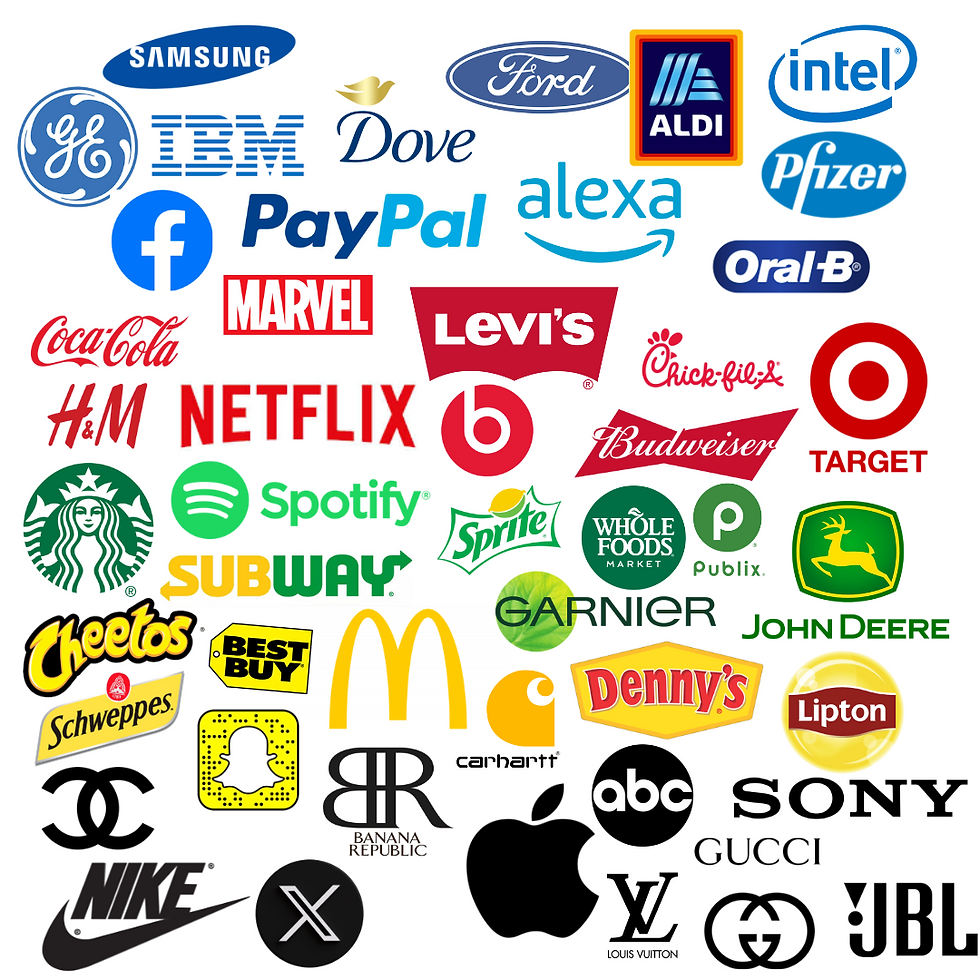
Examples: Facebook, PayPal, or IBM
Red: Passion and Urgency
Red is an attention grabber and evokes strong emotions like excitement and urgency. Red should be used sparingly to highlights important elements on your website, such as the call-to-action.
Best for: Retail, food, the entertainment industry
Example: Coca-Cola's iconic logo
Green: Growth and Balance
Green reads as natural and healthy. It promotes the idea of growth. Green is ideal for brands looking to emphasize their eco-friendliness and sustainability efforts.
Best for: Environmental organizations, health brands, wellness industries
Examples: Whole Foods, Starbucks, Spotify
Yellow: Optimism and Energy
Yellow conveys happiness and positivity within a brand. Yellow is attention grabbing, but like red, it should be used sparingly as it can be overwhelming for some consumers.
Best for: Youthful, energetic brands
Example: Iconic McDonald's arches
Black: Sophistication and Power
Black exudes elegance, luxury, and authority. It work best for high-end brands and minimalist designs.
Best for: Fashion, luxury goods, modern technology
Examples: Nike, Gucci, Apple
Tips for Using Color Effectively:
Understand your audience: Different cultures and demographics may interpret colors differently, do your research.
Limit your palette: Stick to 2-3 primary colors for a cohesive look.
Test user reactions: Use A/B testing to see how color changes impact user behavior.
Choosing the right colors is all about aligning your brand's goals and resonating with your audience. The right color palette can elevate your branding and improve user experience, making your website both memorable and effective.


Comments